Although a lot of this book is sculpture and very old interpretations of this mythical creature, there are some more up to date (when I say up to date I mean in the last few hundred years) illustrations that are absolutely beautiful. Some tweaks will need to be made so they will be a suitable resource for me to use as reference. I also really love the layout of the book, as it is filled with a lot of useful information about mermaids and has a few quotes from some famous writers and philosophers.
I need to handle this one carefully also and make sure the mermaids don't look too suggestive, which will be quite easy as I can just give them long flowing hair which will add to the illustrative quality as well.
I need to handle this one carefully also and make sure the mermaids don't look too suggestive, which will be quite easy as I can just give them long flowing hair which will add to the illustrative quality as well.

I thought a similar style colouring would look quite interesting next to my idea of having washed out watercolour against neon.

I also love the detail in the background in this image and will think about incorporating a similar style for my illustrations on the outside and inside covers.

In terms of fairies, the thing that first popped into my head without any hesitation was a series of books I read when I was younger called the Spiderwick Chronicles. It was marketed as a field guide to spotting mythical creatures such as fairies, goblins, wood elves and such. I used to spend hours looking at the illustrations within them as they are just so gorgeous, and I feel if I employ a similar style it would make my product look even more at home in Liberty.
My favourites were always the Faeries/Sprites and Elves.
I love the way the illustrator, Tony DiTerlizzi, uses washed out colours to create his 'anatomically correct' drawings of the wondrous world of Spiderwick.


(still from movie)
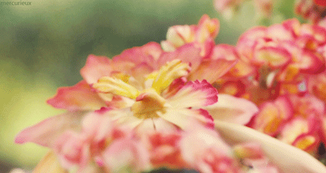
To help my research for butterflies, I have just started to collect imagery from books so I can begin to try out various shapes and styles and I find it best to work from actual photographs. I feel this one will be quite easy to work in with the faeries as the colours are just made for each other, and i'm quite excited by the prospect of this.

I think brusho inks would work quite well when creating this imagery, as I need the vibrancy for the colours.


I want to find a way to make this butterfly's wings work, as I think the transparency is beautiful. I could even had it on my little character for the page divider.


For my final girl's concept, I have slightly deviated form the generic 'cute animals' option. And I'm broadening it to baby british wildlife, maybe just fauna. Obviously to appeal to little girls they'll still be 'cute' but in a more anatomically correct style now, instead of the more japanese kawaii bold shape and colour I was going to employ before I thought it through and realised I was being stupid as this would look horrific as I can't do it.
The next set of images are from Fauna Britannica by Duff Heart Davis, I thought it would be valuable to research actual photographs before deciding on some artists to research as an influence later on. I also thought that these photos are really nice in that they show the funny personalities of some animals and I feel this is an important factor when creating a children's product.


I was also thinking instead of stereotypical british animals I would go for ones that are often forgotten as these could potentially have the most mystery for children and would stimulate them more intellectually....
No comments:
Post a Comment