Wednesday 13 May 2015

Self Evaluation

This project has been one of my favorites so far, simply because of the freedom we were granted. I feel as though, in hindsight, I should have possibly developed my idea more as when i started to create my initial sketches for of the triptychs and bags, i found i could not capture some of the people i had originally elected to do. However, the illustrated portraits that i have completed for this hand in are something i feel i can be proud of. 
In terms of initial research I feel as though I covered a wide variety of relevant topics, which has definitely helped with this project as it has gone on. I feel as though the idea for this module was interesting from the beginning and i feel as though i have set out and created products that are very close to the picture i had in my head when first starting out. 
Admittedly, I have encountered my fair share of problems towards the end of this project, one being the screen printing. I set out to do it in one day but unfortunately on the day i was booked in the emulsion used to coat the screens just wouldn't take, so instead of leaving all of it for another day, I set up paper stencils for all of the halo's on the bags so i had something to come back to when the emulsion was changed. using this simple stencil technique I was able to speed through the screen printing when the time came as the foundations were already set. Each bags is slightly different due to the nature of screen printing and each offer a really nice, lo-fi off kilter appearance. 
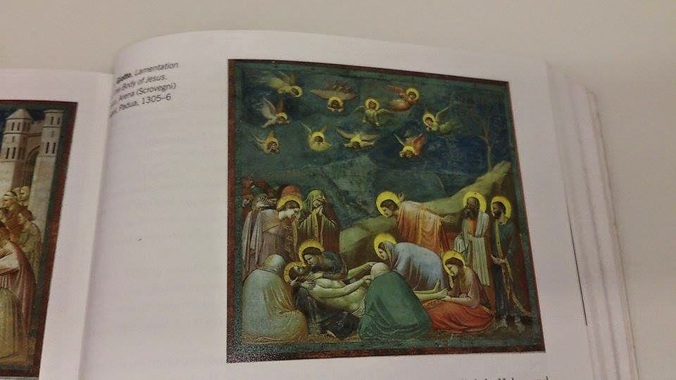
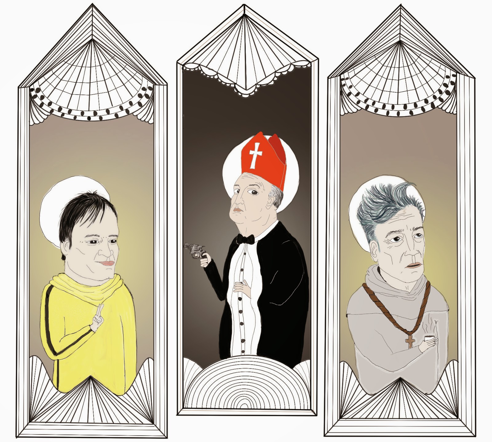
In terms of the triptychs, as the project went on I felt as though simple black line drawings just weren't going to look right, this is when i began to colour them and finish them up in Photoshop. this not only furthered my knowledge with this application but it also gave a new life to the idea. I am extremely happy with these triptych prints i have created and I feel, even though all are created in a similar style, you can see my progression with this new style through them. 
In terms of the finished products, I feel as though they are going to appeal to the artistic people i stated were my predicted demographic, I have already received requests to print more to sell up in Hartlepool after the London market which i fins really encouraging. 
Although my business cards did not arrive in time for hand in, I have printed out a copy just to show what they will look like alongside my products. 
All in all, my 'Creative Saints' are something that I feel I can really be proud of and work to sell as many as possible of in London, I know it will be difficult but hopefully my passion for this project will show and people will connect with this idea of modern day society's obsession with celebrity and idolising our favourites.      


triptychs

Due to unforeseen circumstances, i unfortunately did not have time to screen print the gold over my triptychs and this is something i will rectify before travelling down to London, for the purposes of hand in i will line in gold pen to show the aesthetic i was aiming for. 

Tuesday 12 May 2015

printing

Having now printed my tote bags all that is left is to complete is the gold on the triptychs. I am pretty happy with how the bags have come out, obviously every one is different as is the nature of screen printing but i feel as though it just adds to the lo-fi style that initially inspired me. 

The initial plan was to screen print both the halos and the black line work but when it came to it, a paper stencil on taped on a screen was easier to do and was much less time consuming. 


overall my day printing was pretty successful and all that is left to complete on the bags is the name banners, which are all ready to go and should take half an hour to get fully completed. 

Thursday 7 May 2015

directors

today i have been starting and finishing my directors triptych. It is not as busy as my other two illustrations but i took a simple approach to the portraits of saints with the gradient backdrop and have them posed with items of significance to their characters. I also thought it would be nice for these portraits to looked posed an staged as that is what these men do for a living. 
i feel, as i near the finish that my skills as a portraits artists are growing and i have managed to develop this style into something really worth pursuing. 


Wednesday 6 May 2015

business cards and branding

I have been working on business cards alongside this project. I wanted something that showcased both my work and was lively and reflected me a bit. In terms of my work, it can be quite varied at times and i wanted to show what i have done in both illustration and in textiles. 
I want to play about a bit more but for now these will serve what purpose i have designed them for. 


Mighty Boosh triptych


As the above process shows I have traced the basic triptych shape from the bettie and bunny piece for continuity in the prints, each will offer very different things but will maintain a uniform shape. Again I will be screen printing the gold border. 
This pieces theme is a lot more literal in terms of religious scenes, i'm pretty happy with my own nativity scene. 

Tuesday 21 April 2015

moving on to new people

Started on my saints of comedy, hopefully these should move faster in terms of envelopment as i know the definite look I am after. 


 Steve coogan and mighy boosh. i'm not entirely sure as yet on the bags i will actually produce.. in retrospect and upon reviewing my learning agreement, i have stated i will create 15 bags... and the more i produce these portraits the more i'm thinking i will do a run of five saint bettie and saint bunny , five of the mighty boosh and five of my director saints. I feel as though these three are the strongest in terms of how i've managed to capture the people in the triptychs. 

first one done!

So finally I think i have done with this triptych! moved away from the original idea of the bondage cross and went for a garden of earthly delights inspo for the middle panel. The black outlines will have gold ink screen printed over them. 


Tuesday 14 April 2015

first triptych development

I have started on the layout for the first triptych , i'm pretty happy so far and feel as though it's a good mixture between the historical influence and the modern style i am also going for alongside a few cheeky twists that I feel are appropriate for the characters of this set.

The middle of the triptych is going to feature a bondage cross upon a hill of erotic polaroids. Should be super fun to draw! 

Monday 13 April 2015

Change in printing

After reviewing  my Learning Agreement I realise that if I were to print in the way the previous blog post stated i would be too far from the finished product i have described in the agreement. Instead i am now simply using a simple black one screen print. Also, for the triptychs I have elected to have them printed properly with a matte finish and the go over them with the gold border that will be screen printed on. In addition to the two final products i am thinking of adding in a few extras such as stickers and badges. 

Thursday 26 March 2015

Photoshop to tote bags

At this moment in time I have now scanned in my images of Saint Bettie and Saint Bunny and am working on them in Photoshop. Originally I was going to leave them as just simple black line drawings, but the endless possibilities of Photoshop have got me again and I am in the process of adding full colour to them. It simply means that the process of screen printing them will be slightly more complicated. basically I will need to take each colour individually and add them to a new layer, but also print the separate layers in black so they will work on a screen and just pull through the colours as needed. 

This is A nearly finished Saint Bette for the front of the tote bag allocated to The photography Saints that are Bunny Yeager and Bettie page. I have also started on the two figures of the women of the triptych I am also creating. 

The same rules will basically apply to this screen print, as I didn't know it should be done in many layers and printed, when the time comes to move them down to the print room I will have to do each of these layer by layer and deconstruct them essentially. Unlike the other portraits to come, as now i know to produce each layer individually to make it easier for myself. 


Monday 9 March 2015

Ghent Altarpiece

As a quick point of research I have looked at the Ghent Altarpiece by Jan Van Eyk, between 1430-1432. It is an extremely famous religious triptych, with a lot of religious imagery. It is made up of 12 panels, 8 of the panels are hinged, it is an absolute work of art not just in terms of the painting itself but the triptych as a whole. 
Open:


Closed:


I will have to also consider what will be on the front of the fold out, rather than creating more panels, I might just keep it simple with a banner stating the saints that are inside. 

Hands and progress

I fel as though I'm progressing at a faster pace this last week, soon i'll be done with Bettie and Bunny and can carry on with the other Saints. I feel as though focussing on the small details like hands is important because of the range of work I have to do, as religious art is full of small details and symbolism. I have definitely improved when it comes to drawing hands and i'm really happy with this as they still translate the style I am going for. 


I have started to also plan my final layout for this part of the project. obviously it needs plenty more work and panning but it's quite an interesting start.  


I have also began to look at the meaning behind the hand symbols i am using. It has opened me up to a few more symbols I want to incorporate into my work in some way. 


Thursday 5 March 2015

Contemporary religious art

From conducting a quick google search on this subject, I have found that a lot of this style of art is still very similar to the old masters paintings. Although I have noticed that contemporary religious art  is getting a slight push from various artists who are using the classical imagery in a new way. 

St. Garf (The Annunciation)Ian Byrne, 2014

Obviously this piece is similar to mine in that it is using a famous figure in place of a religious character. I do actually really like this style, the smudged paint strokes are really nice. 


This stylised piece is really cool, Using religious imagery to create a fantastical being. I may strive to create more in depth pieces with more imagery in them. 


More Copyrighting

I have been looking more into copyrighting laws as what i'm doing seems to be kind of a grey area. Apparently, if the work I am creating is my own intellectual property and I am just using a face to create a character i should be fine. Especially as I am not copying directly from photographs and am creating a new persona for these people. 
"If you've created, invented, or named something that you're selling, you already have intellectual property." 
I feel much happier proceeding with the project now I am more aware that i'm basically are to do this style of product. 

Patents, registered designs, trade marks and copyright for dummies: John Grant, Charlie Ashworth and Henri Charmasson: John Wiley &Sons, Ltd. 


Medieval triptychs and further religious imagery

I have been looking at more religious imagery and triptychs, to further my knowledge on this style of religious portraiture. 


They vary in, some are extremely decadent whilst others remain fairly simple. I want to find a good medium between the two, and figure out the placement for my own figures. 
I ave also been looking up other religious imagery that can be incorporated into these illustrations from a really good site: 
http://symboldictionary.net

Art of the Middle Ages, Thames and Hudson
Treasures of the Vatican, Thames and Hudson

Progress?


As these portraits go on I am beginning to find it easier to draw these women. I am also getting more and more ideas for my triptychs I wish to produce, from now on I will be focussing on this. I am slightly behind with starting to print my bags but I am confident that I will be able to complete everything within time. 
I feel as though my style has changed again for this brief and I do actually really like the works I am producing at the minute, all except the bottom right portrait. It's just too juvenile, I do however like the inks on the Halo. I am think more about incorporating inks into these initial drawings as I may use them for prints.